
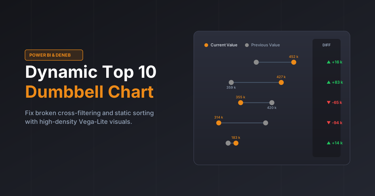
Standard Power BI visuals frequently break user experience when combining ranking, sorting, and cross-filtering. Implementing a Dynamic Top 10 Dumbbell Chart in Power BI using Vega-Lite (Deneb) guarantees that your top lists dynamically recalculate and re-sort by Current Value on every user interaction.
Table of Contents
The Filter & Sorting Trap vs. a Dynamic Top N Dumbbell Chart in Power BI
Native visual-level Top N filters in Power BI evaluate rankings and sorting rules globally before cross-filtering takes place, producing frozen or confusing charts during dashboard exploration.
- 🛒 The Scenario: You have a global sales dashboard featuring a visual sorted by Current Value descending.
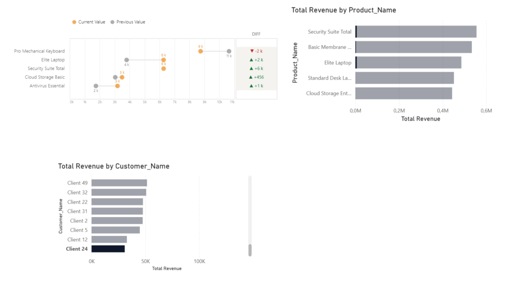
- ❌ The Native Sorting & Filter Flaw: When a user clicks „Client 24” on another visual, native clustered bar charts fail in two ways:
- Broken Ranking: They display the global Top N products with dimmed bars, leaving blank rows if those global items didn’t buy by Client 24.
- Lost Sorting: The visual retains its static global sort order rather than dynamically re-sorting the active Client 24 sales from highest to lowest.
- ✅ The Dumbbell Fix: A Dynamic Top N Dumbbell Chart in Power BI recalculates the
windowrank and sorting pipeline after cross-filter context is applied, ensuring a clean, perfectly sorted 1-to-N ranking for Client24.
Why a Dynamic Top N Dumbbell Chart in Power BI Beats Clustered Bars
Clustered bar charts comparing Current Year (CY) against Previous Year (PY) consume too much screen space, double visual clutter, and lack dynamic responsiveness.
- 🔀 Guaranteed Re-Sorting on Interaction: Sorts strictly by
Current Value descendingon the fly, eliminating awkward, out-of-order bars during cross-filtering. - 🚀 High Data-to-Ink Ratio: Replaces bulky pairs of 20 thick bars with slim connecting tracks and clean endpoint markers.
- 📊 Integrated Variance Column: Embeds a dedicated
DIFFpanel right next to the categories, removing the need for auxiliary KPI cards or secondary tables. - 🧹 Instant Visual Clarity: Directs attention immediately to the magnitude and direction of growth across each category.
How to Power a Dynamic Top N Dumbbell Chart in Power BI with Vega-Lite
The Deneb/Vega-Lite transformation pipeline executes ranking, formatting, and collision avoidance directly inside the visual layer:
- ⚡ Post-Filter Sorting & Ranking: Executes a
windowtransform to calculaterankstrictly on filtered records sorted byCurrent Value descending, keeping onlyrank <= 10. - 🎨 Conditional Trend Styling: Automatically applies dynamic directional arrows (
▲/▼) and colors positive gains green (#137333) and negative drops red (#C5221F). - 🛡️ Smart Anti-Collision Data Labels: Evaluates
datum['Diff']to hide the Previous Year label whenever values are within 15% (or 30k) of each other, ensuring numbers never overlap.
Switching to a Dynamic Top N Dumbbell Chart in Power BI resolves native cross-filtering and sorting limitations while delivering clean, publication-ready variance reporting.
Download the Template & Use It in Your Reports
Ready to eliminate static sorting bugs and elevate your dashboard design? You can grab the complete, copy-paste-ready Vega-Lite JSON specification and drop it straight into your Deneb visual.
📥 Download the Vega-Lite JSON Code (click below link)
Feel free to adapt the colors, label thresholds, and category counts to fit your organization’s design system!