
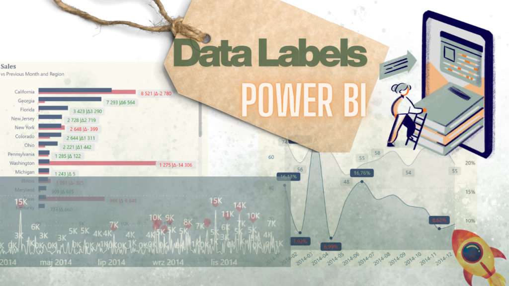
When it comes to data visualization in Power BI, data labels can either elevate your report or completely overwhelm your audience. Power BI data labels are meant to clarify your story—not create visual noise. Yet many users switch them on for every bar, line, and column, only to end up with a chart full of numbers that no one can read or connect with the right variable.
In this guide, I’ll walk through practical, user-friendly techniques for presenting data labels effectively, reducing clutter, and highlighting what truly matters—all while using features available directly in Power BI.
Table of Contents
1️⃣ First: Understand Why Data Labels Become a Problem
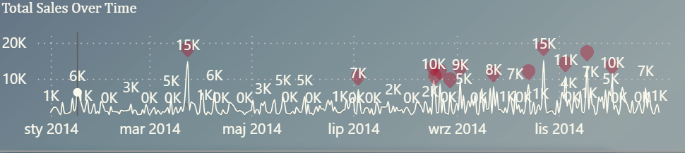
As soon as we add multiple measures, categories, or time periods, data labels often stack on top of each other, making it nearly impossible to see:
- Which value belongs to which series
- How one category compares to another
- What the chart is supposed to communicate
This is a common challenge in Power BI bar charts and line charts, especially when the dataset grows or when we use small canvas areas.
To avoid overwhelming users, we need to be intentional about when and how data labels are applied.
2️⃣ Second: Use the “Density” Option — When It’s Available
One of the most effective underused features in Power BI is the Data label density setting. It allows Power BI to automatically show fewer labels, focusing only on the most meaningful ones. This reduces clutter and makes the chart readable without manual intervention.
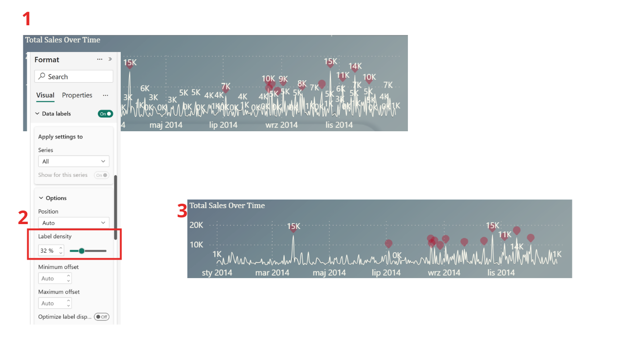
🔍 Why Density Is Not Always Available
The density option doesn’t appear for every visual. Power BI enables it only when:
- The chart type supports dynamic label placement (mainly line charts)
- The internal rendering engine allows skipping values intelligently
- The data structure meets certain formatting requirements (e.g., continuous axes)
So if you’re building a bar or column chart—or working with categorical axes—you may not see the density setting. In those cases, we need alternative strategies.
3️⃣ Third: Improve Visibility by Styling Your Data Labels
Even when every label is necessary, you can still enhance readability through formatting. Power BI data label formatting offers powerful customization options:
🎨 Style Tips for Clear Data Labels
✔️ Use contrasting colors
Assign label colors that stand out against bar or line colors.
✔️ Add a background to labels
A subtle background improves readability, especially on colorful visuals.
✔️ Increase font weight or size
Small adjustments dramatically change scanability.
These minor stylistic changes often bring clarity without altering the amount of information shown.
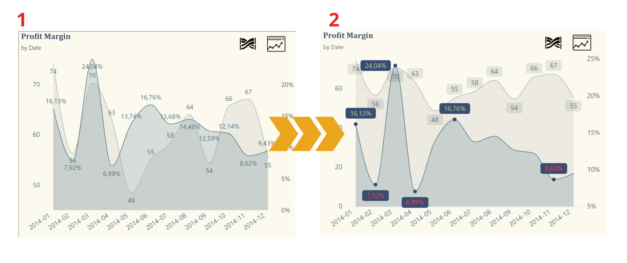
4️⃣ Fourth: Show Only the Most Important Values (Top/Bottom Method)
When the chart includes many values, showing all labels is rarely useful. A more effective technique is to display data labels only for the top 3 and bottom 3 values. This solution:
- Highlights the most significant insights
- Keeps the chart clean
- Draws attention to extremes (high and low performers)
This can be implemented by:
- Creating a measure that flags the highest and lowest values
- Applying conditional visibility
- Highlighting selected data points
This storytelling option shifts user focus toward the insights that matter instead of drowning them in numbers.
⚙️ How to Add Labels Only for Top 3 & Bottom 3 in Power BI
Here’s a quick guide to show only the Top 3 and Bottom 3 values as data labels in your Power BI chart — without removing your existing measure.
✅ Step 1: Keep the Original Measure
Don’t delete or change your existing measure (e.g. Profit Margin Percentage). It will still control the chart.
➕ Step 2: Create a New Measure for Labels
Add a new measure called: „Label Profit Margin Percentage (Top3 & Bottom3)”
Label Profit Margin Percentage (Top3 & Bottom3) =
VAR RankDesc =
    RANKX (
        ALLSELECTED ( dim_date[YYYY-MM] ),
        CALCULATE ([Profit Margin Percentage] ),
        ,
        DESC,
        DENSE
    )
VAR RankAsc =
    RANKX ( ALLSELECTED ( dim_date[YYYY-MM] ), CALCULATE ( [Profit Margin Percentage] ),, ASC, DENSE )
RETURN
  IF (
        NOT ISBLANK ( [Profit Margin Percentage] ) && ( ( RankDesc <= 3 || RankAsc <= 4 ) ),
        [Profit Margin Percentage],
        BLANK ()
    )
This measure should return the value only for the top 3 and bottom 3, and BLANK() for everything else (Power BI won’t show labels for blanks).
🧽 Step 3: Clean Up Labels
- Turn off data labels for Profit Margin Percentage
- Turn on data labels for the new Label measure
- Set transparency to 100% (so it’s invisible — only the labels show)
🎯 Step 4: Turn On Markers
Enable Markers so that Power BI knows where to position the labels correctly — especially for line charts.
❗ Troubleshooting: Why Labels Might Not Show
If you don’t see all 6 labels, check the ranking context.
This part of the DAX:
ALLSELECTED ( dim_date[YYYY-MM] )defines what values you’re ranking — usually along the X-axis. If your axis is not dim_date[YYYY-MM], replace it with the actual column used on your visual (e.g. Product, Region, etc.).
🧠 Quick DAX Breakdown
VAR RankDesc =
    RANKX (
        ALLSELECTED ( dim_date[YYYY-MM] ),
        CALCULATE ( [Profit Margin Percentage] ),
        ,
        DESC,
        DENSE
    )
ALLSELECTED→ defines the ranking scopeCALCULATE→ evaluates the measure per contextDESC+DENSE→ ranks from highest to lowest with no gaps
5️⃣ Fifth: Add Variance or Conditional Formatting to Data Labels
Another powerful technique is adding variance values (e.g., YoY or MoM change) directly into Power BI data labels. With conditional coloring, labels instantly become more insightful:
📈 Green → positive trend
📉 Red → negative trend
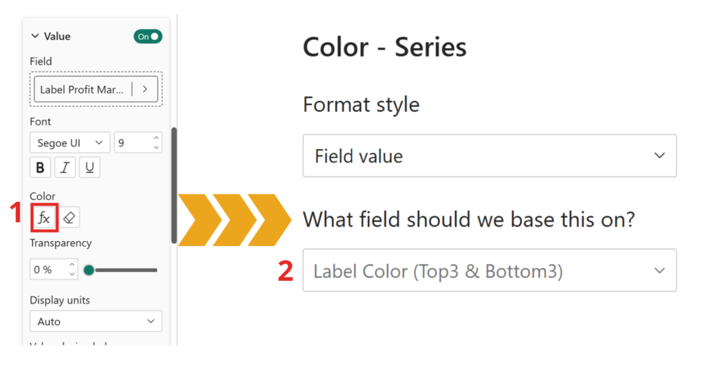
To color Top 3 and Bottom 3 data labels in Power BI, simply create a DAX measure that returns a color based on ranking, then apply it using conditional formatting in Data labels → Color (fx) → Field value.
This way, only the most important values are highlighted, while the chart remains clean and easy to read.
Label Color (Top3 & Bottom3) =
VAR RankDesc =
    RANKX (
        ALLSELECTED ( dim_date[YYYY-MM] ),
        CALCULATE ( [Profit Margin Percentage] ),
        ,
        DESC,
        DENSE
    )
VAR RankAsc =
    RANKX ( ALLSELECTED ( dim_date[YYYY-MM] ), CALCULATE ( [Profit Margin Percentage] ),, ASC, DENSE )
RETURN
    IF (
        RankDesc <= 3,
        "#A1C197",
        // zielony dla TOP 3
        IF (
            RankAsc <= 4,
            "#FF404A",
            // czerwony dla BOTTOM 3
            "#000000" // czarny (domyślny)
        )
    )
This turns basic labels into mini-KPIs integrated directly into the visual.
6️⃣ Sixth: Know When to Avoid Data Labels Entirely
Sometimes the smartest visualization strategy is not using data labels at all.
Charts with dense categories or long time series often communicate better with:
- Tooltips
- Drill-through interactions
- Dynamic text summaries
- Reference lines
- Selective callouts
Finally: Not every number needs to be shown to communicate meaning.
🏁 Finally: Smart Data Labels Lead to Smarter Dashboards
Effective use of Power BI data labels is a skill that separates good dashboards from great ones. By applying the techniques above, you can:
- Reduce visual clutter
- Highlight meaningful insights
- Improve user comprehension
- Tell a clearer, more impactful data story
Whether you use density, conditional formatting, label styling, or top/bottom logic, the goal is always the same:
👉 Make your visuals intuitive and user-friendly–> Useful Resources
🧠 Related Reads
Click the link below the icon to learn how to remove duplicate items and keep only those with the most recent status.
https://www.instagram.com/reel/C-N03baItkh/?igsh=dTc1NWMwNjFsd2l3
👾 Problem: Duplicate entries with old statuses.
🎯 Solution: Keep only the latest and greatest!