
Tables in Power BI – boring? Think again. Most people see them as “Excel in disguise”, but with the right tricks, they can be interactive, visual, and even… a little sexy (yep).
If you’d like to explore these examples hands-on, I’ve prepared a ready-to-use Power BI report with all the solutions described below.
You can download it here:
👉 Click and Grab the materials from my GitHub!
Instead of dumping raw data, you can turn tables and matrices into storytelling tools that wow your audience.
Let’s start with the classic question:
1. 🔄 Table vs. Matrix – Which One to Use?
Table = details. Perfect for invoices, transactions, audits. Straightforward, no hierarchy.
Matrix = big picture + drill-down. Think pivot table with a glow-up. Great for hierarchies, subtotals, and comparisons.
2. 🔄 When Colors Speak Louder Than Numbers 🎨
Rows of grey numbers? Yawn. Add some color, and suddenly your table turns into a conversation starter. Moreover, conditional formatting isn’t just decoration – it’s your secret weapon to highlight what matters without forcing users to scan every digit like accountants on overtime.
How to Let Colors Do the Talking
🔹 Highlight the good, flag the bad
Use traffic-light colors: green for wins, red for problems. One glance, and people know where to look.
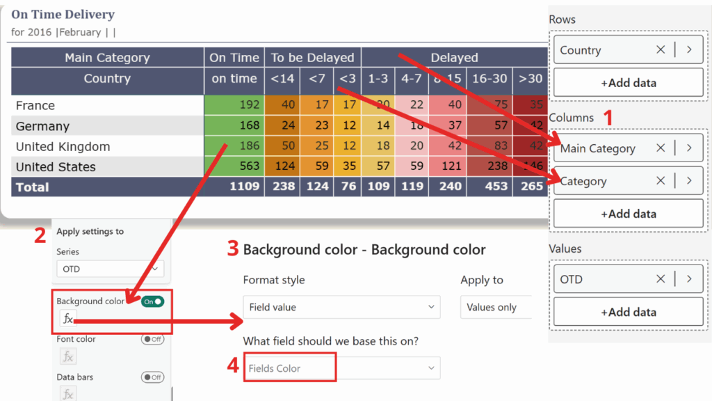
Fields Color =
SWITCH(
TRUE(),
Calculate(Average('Sales Raw Data'[Days]))>30, "#9E2727",
Calculate(Average('Sales Raw Data'[Days]))>15, "#B14F47",
Calculate(Average('Sales Raw Data'[Days]))>7, "#EA8383",
Calculate(Average('Sales Raw Data'[Days]))>3, "#F1BFBF",
Calculate(Average('Sales Raw Data'[Days]))>0, "#E7C363",
Calculate(Average('Sales Raw Data'[Days]))>-3, "#ECB02E",
Calculate(Average('Sales Raw Data'[Days]))>-7, "#E49330",
Calculate(Average('Sales Raw Data'[Days]))>-14, "#C17415",
"#77B558"
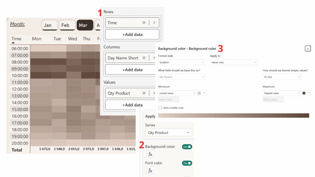
)🔹 Turn numbers into heatmaps
Apply background color gradients. Big numbers glow hot, small ones fade out. Your matrix becomes a mini-heatmap without adding another visual.
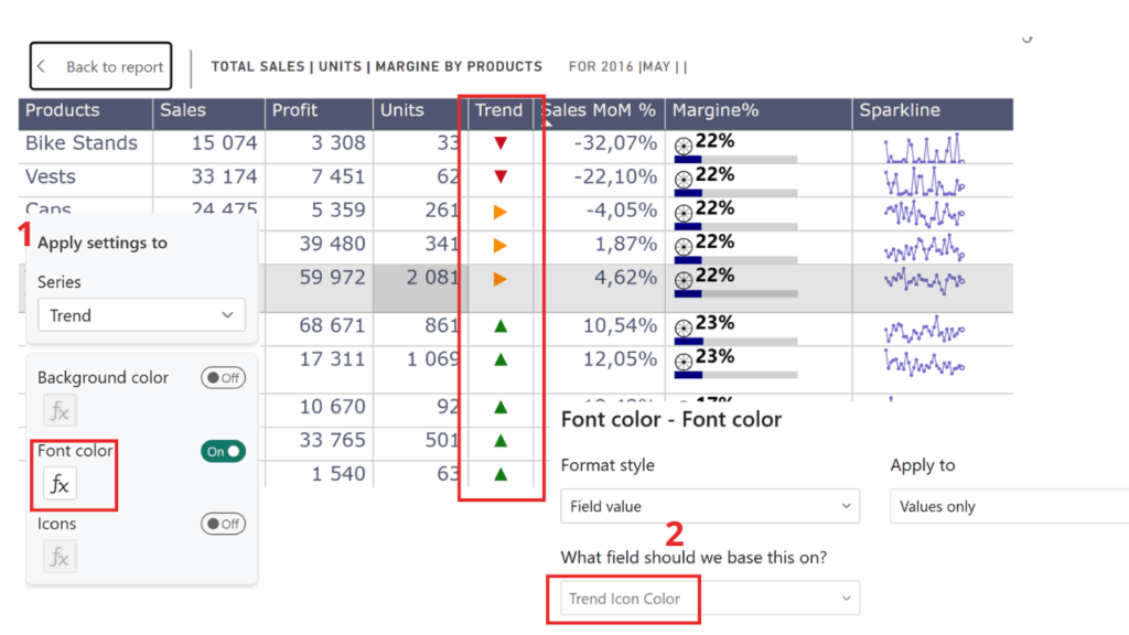
🔹 Icons that tell a story
Who needs words when ▲ ▼ ▶ can say it faster?
Follow these steps to add colored trend arrows into your table:
Trend :=
VAR chg = [Sales MoM %]
RETURN
SWITCH (
    TRUE(),
    ISBLANK(chg), BLANK(),
    chg >= 0.10, UNICHAR(9650),   -- ▲ up
    chg <= -0.10, UNICHAR(9660),  -- ▼ down
                UNICHAR(9654)     -- ▶ stable
)
Trend Icon Color :=
VAR chg = [Sales MoM %]
RETURN
SWITCH (
TRUE(),
ISBLANK(chg), "#000000", -- black/blank
chg >= 0.10, "#107C10", -- green ▲
chg <= -0.10, "#C50F1F", -- red ▼
"#FF8C00" -- orange ▶
)Place Trend Icon in your Table/Matrix
- Firstly, add the
Trend Iconmeasure as a column in your visual.
Apply color formatting using Trend Icon Color
- Secondly, go to Format → Cell elements → Font color.
- After that, choose Format style → Field value.
- Select
Trend Icon Coloras the field.
🔹 Icons on Steroids — SVGs with Color
Unicode arrows are nice, but SVG (Scalable Vector Graphics) takes it up a notch. SVG is a web-friendly image format made of code, so your icons stay crisp at any size and can be styled with any color you like. In Power BI, that means no more broken fonts — just sharp, colorful arrows (or any shape you imagine) directly in your table.
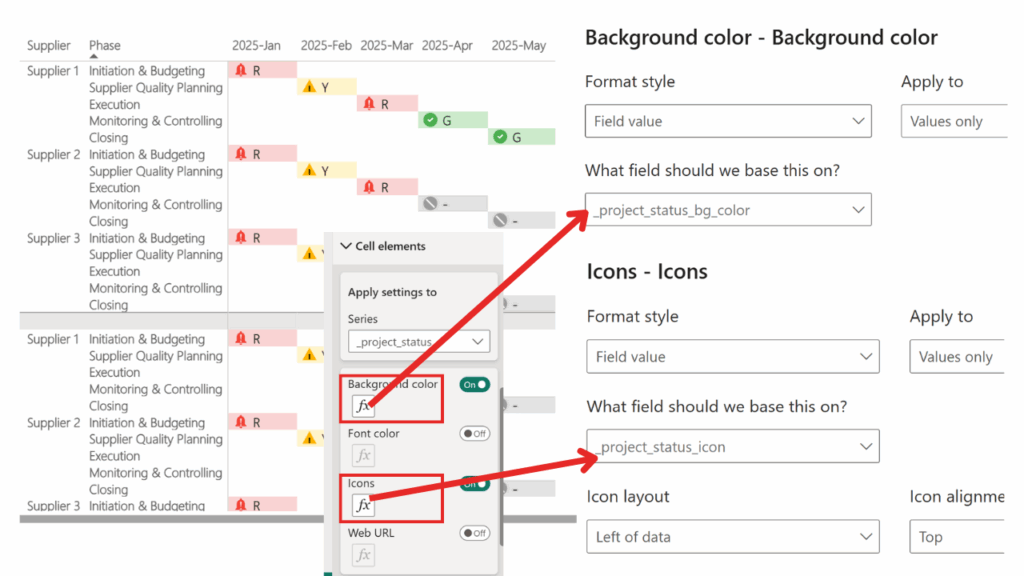
_project_status_bg_color =
SWITCH(
    TRUE(),
    [_project_status] = "G", "#CDEBCC",
    [_project_status] = "Y", "#FFF5CC",
    [_project_status] = "R", "#FAD4D4",
    [_project_status] = "-",  "#E0E0E0",
    "#FFFFFF"
)
_project_status_icon =
SWITCH(
TRUE(),
[_project_status_bg_color] = "#FAD4D4",
"data:image/svg+xml;utf8,<svg xmlns='http://www.w3.org/2000/svg' width='40' height='40' fill='%23F44336' viewBox='0 0 24 24'><path d='M12 22c1.1 0 2-.9 2-2h-4a2 2 0 002 2zm6-6v-5c0-3.07-1.64-5.64-4.5-6.32V4a1.5 1.5 0 00-3 0v.68C7.63 5.36 6 7.92 6 11v5l-2 2v1h16v-1l-2-2z'/><text x='12' y='18' font-size='16' fill='white' text-anchor='middle'>!</text></svg>",
[_project_status_bg_color] = "#FFF5CC",
"data:image/svg+xml;utf8,<svg xmlns='http://www.w3.org/2000/svg' width='40' height='40' fill='%23FFB300' viewBox='0 0 24 24'><polygon points='12,2 22,20 2,20'/><path d='M12 16v-4' stroke='black' stroke-width='2' stroke-linecap='round'/><circle cx='12' cy='18' r='1' fill='black'/></svg>",
[_project_status_bg_color] = "#CDEBCC",
"data:image/svg+xml;utf8,<svg xmlns='http://www.w3.org/2000/svg' width='40' height='40' fill='%234CAF50' viewBox='0 0 24 24'><circle cx='12' cy='12' r='10' fill='%234CAF50'/><path d='M9 12l2 2 4-4' stroke='white' stroke-width='2' fill='none' stroke-linecap='round' stroke-linejoin='round'/></svg>",
[_project_status_bg_color] = "#E0E0E0",
"data:image/svg+xml;utf8,<svg xmlns='http://www.w3.org/2000/svg' width='40' height='40' fill='%239E9E9E' viewBox='0 0 24 24'><circle cx='12' cy='12' r='10' fill='%239E9E9E'/><line x1='6' y1='6' x2='18' y2='18' stroke='white' stroke-width='2'/></svg>",
BLANK()
)Take one icon, for example the red alert bell with “!” inside:

What’s inside?
In short: SVG = lego blocks of shapes (circles, paths, polygons, text). Moreover, you can color them, resize them, or combine them endlessly. That’s why they stay crisp at any zoom and adapt perfectly to Power BI tables.
| Element | What it draws | Example from your icons |
|---|---|---|
<svg> |
The wrapper → sets size, coordinates (viewBox) | <svg xmlns='http://www.w3.org/2000/svg' width='40' height='40' viewBox='0 0 24 24'> |
<circle> |
A circle → center (cx, cy) + radius (r) | green status: <circle cx='12' cy='12' r='10' fill='#4CAF50'/> |
<polygon> |
A polygon → list of (x,y) points | yellow warning triangle: <polygon points='12,2 22,20 2,20'/> |
<path> |
Freeform shape → move/line instructions (M, L, Z) | alert bell: <path d='M12 22c1.1 0 ...'/> |
<line> |
A straight line between two points | grey inactive “X”: <line x1='6' y1='6' x2='18' y2='18'/> |
<text> |
Text inside the icon, can be styled/centered | exclamation mark: <text x='12' y='18' font-size='16' fill='white' text-anchor='middle'>!</text> |
🔹Prompt used to generate these icons
Here’s the kind of prompt you could drop into ChatGPT to get your original SVGs:
Prompt example:
„Create simple SVG icons (red alert bell with exclamation, yellow warning triangle, green success checkmark, grey inactive circle). Each SVG should be minimal, use basic shapes (<circle>,<path>,<polygon>,<text>), fit in a24x24 viewBox, and include proper colors (#F44336, #FFB300, #4CAF50, #9E9E9E). Return inline SVG code that can be embedded in Power BI as a data URI.”
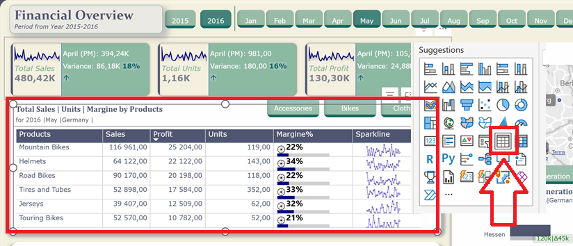
🔹 Data bars inside cells
Why add another chart if you can sneak one into a cell? Data bars turn raw numbers into instant visual comparisons.
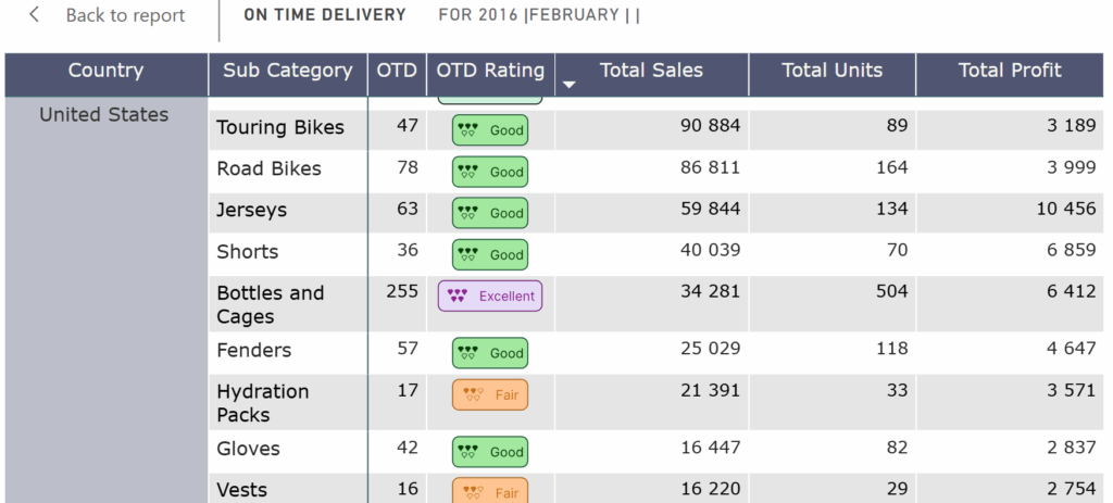
🔹 Buttons with Personality – Status at a Glance
Why settle for boring “Yes/No” or “Active/Inactive” when you can let your buttons speak with style? By using SVG inside Power BI, you can create custom status badges that don’t just show the state of an item – they shout it out.
And here’s the fun part: we’ll design these little buttons in Figma (or any vector design tool you like), then export them as Data URI with SVG and embed directly in a DAX measure. That way, you’re not limited to Unicode symbols or plain formatting – you can unleash your inner designer while keeping everything dynamic inside Power BI.
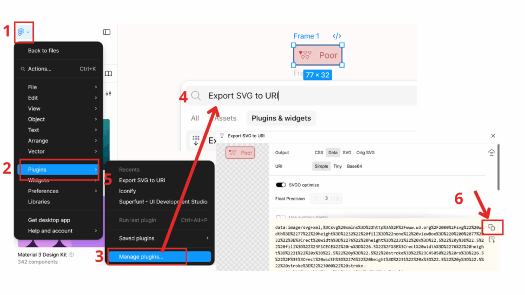
🔹 Converting a Button Object into Data URI with SVG
To export a button as URI you’ll first need a plugin/extension that enables conversion in your design tool.
- Install the export plugin (e.g., Export SVG to URI).
- Select the button object (shape).
- Use the plugin to convert/export as code.
- Check the output: open the generated file or inspect the code to confirm it contains valid markup.
- Important: when embedding the code directly (e.g., in Power BI or HTML), always prefix the code with:
data:image/svg+xml.
This ensures the code is recognized correctly as inline image data.
OTD Rating =
SWITCH(
TRUE(),
[OTD]>=0 && [OTD]<=5 ,
"code copied from figma (too long to put hear)",
[OTD]>=6 && [OTD]<=20 ,
"code copied from figma (too long to put hear)"
[OTD]>=21 && [OTD]<=100 ,
"code copied from figma (too long to put hear)"
[OTD]>=101 && [OTD]<=200 ,
"code copied from figma (too long to put hear)"
[OTD]>=201 ,
"code copied from figma (too long to put hear)"
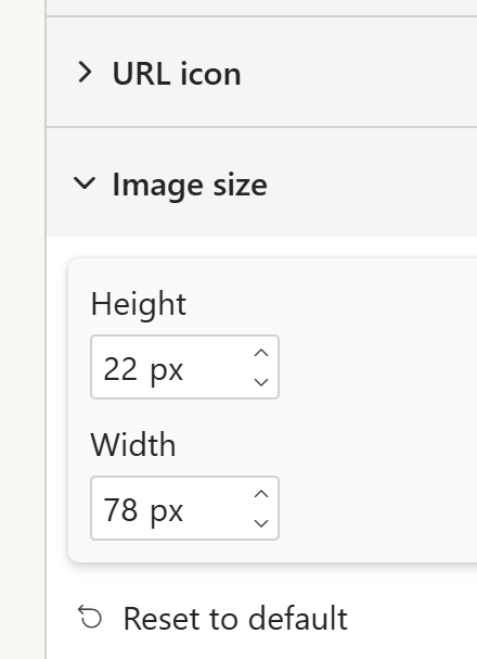
)If the buttons in your Power BI table cells look too small, increase their size in Format → Image size, matching the dimensions used in Figma.
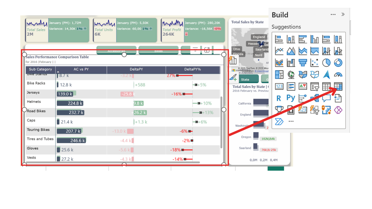
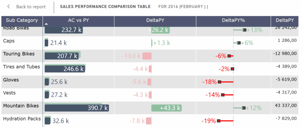
🔹 Visual Variance Table – When Numbers Meet Mini Charts
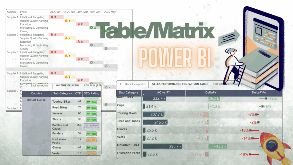
Looks familiar? Yep, it’s like that “Zebra BI package look-alike” table, but home-brewed with Power BI magic and a sprinkle of SVG. You get AC vs PY, absolute deltas, and % changes all packed into one compact view. It’s basically a dashboard wearing a table costume – clean, visual, and straight to the point.
DeltaPY% SVG =
//----------------------------------------------------
// DeltaPY% SVG Measure
// Creates a tiny "pin chart" visual inside a table cell
// showing relative difference between AC and PY in %
// Positive = green, Negative = red, with a black pinhead
//----------------------------------------------------

-- 🎨 Colors
VAR _ColorAxis  = "#c6c6c6"   // neutral axis line
VAR _ColorNeg   = "#ff0000"   // negative delta
VAR _ColorPos   = "#8FBF9F"   // positive delta (sage green)
VAR _ColorHead  = "#404040"   // black pinhead

-- 🔢 Actual value in integer % (e.g. 1200 = 1200%)
VAR _ValuePctInt =
    IF (
        HASONEVALUE('Sales Raw Data'[Sub Category]),
        [DeltaPY%],  -- single category → actual value
        AVERAGEX(ALLSELECTED('Sales Raw Data'[Sub Category]), [DeltaPY%])  -- total row → average
    )

-- 📐 Convert to fraction for scaling the bar
VAR _Value = DIVIDE(_ValuePctInt, 100.0)

-- 📊 Find the max absolute value across current selection
-- This ensures consistent scaling for all rows
VAR _GlobalAbsMaxRaw =
    MAXX(ALLSELECTED('Sales Raw Data'[Sub Category]), ABS(DIVIDE([DeltaPY%],100.0)))
VAR _GlobalAbsMax = MAX(_GlobalAbsMaxRaw, 1e-9) * 1.05  // add buffer, avoid divide by zero

-- 📏 Calculate bar width as fraction of half-axis (left/right)
VAR _WidthFrac = MIN(0.5 * ABS(DIVIDE(_Value, _GlobalAbsMax)), 0.5) * 0.65
VAR _WidthPct  = FORMAT(_WidthFrac, "0.0%")

-- 📍 Bar starting point (left or right of axis)
VAR _XBarStart = IF(_Value >= 0, "50%", FORMAT(0.5 - _WidthFrac, "0.0%"))

-- ⚫ Pinhead position (small black rectangle at bar end)
VAR _PinHalf   = 3 / 200.0
VAR _XPinHead =
    IF(_Value >= 0,
       FORMAT(0.5 + _WidthFrac - _PinHalf, "0.0%"),
       FORMAT(0.5 - _WidthFrac - _PinHalf, "0.0%"))

-- 🏷 Label as plain % (e.g. +12%, -8%)
VAR _ShortPct = FORMAT(_ValuePctInt, "+0\%;-0\%;0\%")

-- 🔠 Font size logic → smaller if text is too long
VAR _Len = LEN(_ShortPct)
VAR _FontPx = SWITCH(TRUE(),
    _Len >= 7, 6,   // really long values
    _Len >= 6, 7,   // medium length
               8    // default
)
VAR _FontSize = FORMAT(_FontPx, "0") & "px"

-- 📌 Label position: always outside the bar
VAR _LabelX       = IF(_Value >= 0, FORMAT(0.5 + _WidthFrac, "0.0%"), _XBarStart)
VAR _LabelAnchor  = IF(_Value >= 0, "start", "end")
VAR _LabelDX      = IF(_Value >= 0, 6, -6)

-- 🎨 Colors for bar and text
VAR _BarColor  = IF(_Value >= 0, _ColorPos, _ColorNeg)
VAR _TextColor = _BarColor

-- 🖼 SVG output
RETURN
"data:image/svg+xml;utf8," &
"<svg xmlns='http://www.w3.org/2000/svg' width='100%' height='100%'>
  <!-- zero axis -->
  <line x1='50%' x2='50%' y1='0%' y2='100%' stroke='" & _ColorAxis & "' stroke-width='1'/>
  <!-- pinhead -->
  <rect y='35%' x='" & _XPinHead & "' width='10' height='30%' fill='" & _ColorHead & "'/>
  <!-- delta bar -->
  <rect y='45%' x='" & _XBarStart & "' width='" & _WidthPct & "' height='10%' fill='" & _BarColor & "'/>
  <!-- percentage label (always outside) -->
  <text text-anchor='" & _LabelAnchor & "'
        x='" & _LabelX & "' dx='" & _LabelDX & "' y='55%'
        dominant-baseline='middle'
        font-size='" & _FontSize & "'
        fill='" & _TextColor & "'>" & _ShortPct & "</text>
" & [SVG Style] & "</svg>"
DeltaPY SVG =
//----------------------------------------------------
// DeltaPY SVG Measure
// Creates an in-cell variance bar chart (absolute delta)
// Positive = sage green, Negative = dusty rose
// Labels adapt position (inside or outside the bar)
//----------------------------------------------------

-- 🎨 Colors
VAR _ColorAxis  = "#CBD5E1"   // neutral axis
VAR _ColorPos   = "#8FBF9F"   // positive delta (sage green)
VAR _ColorNeg   = "#EFB5B9"   // negative delta (dusty rose)
VAR _TextInside = "#FFFFFF"   // white text when label is inside the bar

-- 🔢 Delta value (absolute difference AC - PY)
VAR _Value =
    IF (
        HASONEVALUE('Sales Raw Data'[Sub Category]),
        [DeltaPY],  -- for single category
        AVERAGEX(ALLSELECTED('Sales Raw Data'[Sub Category]), [DeltaPY])  -- for total row
    )

-- 📊 Global maximum (abs) for consistent scaling
VAR _GlobalAbsMaxRaw =
    MAXX(ALLSELECTED('Sales Raw Data'[Sub Category]), ABS([DeltaPY]))
VAR _GlobalAbsMax = MAX(_GlobalAbsMaxRaw, 1e-9) * 1.05  // add buffer + avoid divide by zero

-- 📏 Bar width as a fraction of half-axis (0..0.5)
VAR _WidthFrac = MIN(0.5 * ABS(DIVIDE(_Value, _GlobalAbsMax)), 0.5) * 0.9
VAR _WidthPct  = FORMAT(_WidthFrac, "0.0%")

-- ⚖️ Threshold for deciding if label can fit inside the bar
VAR _InsideThreshold = 0.14
VAR _PlaceInside     = _WidthFrac >= _InsideThreshold

-- 📍 Bar starting point
VAR _XStart = IF(_Value >= 0, "50%", FORMAT(0.5 - _WidthFrac, "0%"))

-- 🏷 Shortened label: 1.2k / 2.5M / 980
VAR _AbsV = ABS(_Value)
VAR _Short =
    SWITCH(
        TRUE(),
        _AbsV >= 1000000, FORMAT(DIVIDE(_Value, 1000000), "+0.0\ M;-0.0\ M;0"),
        _AbsV >= 1000,    FORMAT(DIVIDE(_Value, 1000),    "+0.0\ k;-0.0\ k;0"),
                          FORMAT(_Value, "+#,0;-#,0;0")
    )

-- 🔠 Adaptive font size (smaller on narrow bars)
VAR _FontSize =
    SWITCH(TRUE(),
        _WidthFrac < 0.05, "5px",
        _WidthFrac < 0.08, "6px",
        _WidthFrac < 0.12, "7px",
        _WidthFrac < 0.18, "8px",
                           "9px"
    )

-- 📌 Label positioning (inside or outside the bar)
VAR _LabelX =
    IF(
        _PlaceInside,
        -- inside: position at bar end
        IF(_Value >= 0, FORMAT(0.5 + _WidthFrac, "0%"), FORMAT(0.5 - _WidthFrac, "0%")),
        -- outside: just beyond the bar
        IF(_Value >= 0, FORMAT(0.5 + _WidthFrac, "0%"), _XStart)
    )

VAR _LabelAnchor =
    IF(
        _PlaceInside,
        -- inside: anchor towards bar interior
        IF(_Value >= 0, "end", "start"),
        -- outside: anchor outward
        IF(_Value >= 0, "start", "end")
    )

VAR _LabelDX =
    IF(
        _PlaceInside,
        -- small inward offset if inside
        IF(_Value >= 0, -4, 4),
        -- outward offset (bigger for wider bars)
        SWITCH(TRUE(),
            _WidthFrac < 0.05, IF(_Value >= 0, 2, -2),
            _WidthFrac < 0.08, IF(_Value >= 0, 3, -3),
            _WidthFrac < 0.12, IF(_Value >= 0, 4, -4),
                               IF(_Value >= 0, 5, -5)
        )
    )

-- 🎨 Bar + label colors
VAR _BarCol  = IF(_Value >= 0, _ColorPos, _ColorNeg)
VAR _TextCol = IF(_PlaceInside, _TextInside, _BarCol)

-- 🏋️ Font weight (bold for total row)
VAR _FontWeight =
    IF(HASONEVALUE('Sales Raw Data'[Sub Category]), "normal", "bold")

-- 🖼 Final SVG
RETURN
"data:image/svg+xml;utf8," &
"<svg xmlns='http://www.w3.org/2000/svg' width='100%' height='100%'>
  <!-- center axis line -->
  <line x1='50%' x2='50%' y1='0%' y2='100%' stroke='" & _ColorAxis & "' stroke-width='1'/>
  <!-- delta bar -->
  <rect y='17%' x='" & _XStart & "' width='" & _WidthPct & "' height='67%' fill='" & _BarCol & "' rx='3' ry='3'/>
  <!-- adaptive label (inside or outside) -->
  <text text-anchor='" & _LabelAnchor & "'
        x='" & _LabelX & "' dx='" & _LabelDX & "' y='55%'
        dominant-baseline='middle'
        font-weight='" & _FontWeight & "'
        font-size='" & _FontSize & "'
        fill='" & _TextCol & "'>" & _Short & "</text>
" & [SVG Style] & "</svg>"
🔹 AC,PY SVG
AC,PY SVG =
//----------------------------------------------------
// AC vs PY SVG Measure
// Creates an in-cell comparison chart between
// Actual (AC) and Previous (PY) values
// Adds an average line and smart labels for AC
//----------------------------------------------------
-- 🎨 Colors
VAR _ColorAC = "#475569" // slate (AC bar)
VAR _ColorPY = "#8FBF9F" // sage (PY bar, semi-transparent)
VAR _ColorAvg = "#5E7F7A" // teal (average line)
VAR _TextInside = "#FFFFFF" // white text for labels inside bars
-- 🔢 Values
VAR _ValueAC = [AC]
VAR _ValuePY = [PY]
VAR _ValueAvg = [Average AC]
-- 🏋️ Font weight (bold for total row)
VAR _FontWeight =
IF(HASONEVALUE('Sales Raw Data'[Sub Category]), "normal", "bold")
-- 📊 Global max for scaling both AC and PY consistently
VAR _globalMax =
MAXX(ALLSELECTED('Sales Raw Data'[Sub Category]), MAX([AC], [PY])) * 1.10
-- 📏 Bar widths
VAR _WidthACFrac = DIVIDE(_ValueAC, _globalMax)
VAR _WidthAC = FORMAT(_WidthACFrac, "0%")
VAR _WidthPY = FORMAT(DIVIDE(_ValuePY, _globalMax), "0%")
VAR _WidthAvg = FORMAT(DIVIDE(_ValueAvg, _globalMax), "0%")
-- 🏷 Shortened AC label: 1.2k / 3.4M / 980
VAR _AbsV = ABS(_ValueAC)
VAR _ShortAC =
SWITCH(
TRUE(),
_AbsV >= 1000000, FORMAT(DIVIDE(_ValueAC, 1000000), "0.0\ M"),
_AbsV >= 1000, FORMAT(DIVIDE(_ValueAC, 1000), "0.0\ k"),
FORMAT(_ValueAC, "#,0")
)
-- ⚖️ Threshold for placing label inside the bar
VAR _InsideThreshold = 0.12
VAR _PlaceInside = _WidthACFrac >= _InsideThreshold
-- 📌 Label positioning
VAR _LabelX = _WidthAC // always at the end of the bar
VAR _LabelAnchor = IF(_PlaceInside, "end", "start")
VAR _LabelDX = IF(_PlaceInside, -4, 6)
VAR _TextCol = IF(_PlaceInside, _TextInside, _ColorAC)
-- 🔠 Adaptive font size
VAR _FontSize =
SWITCH(TRUE(),
_WidthACFrac < 0.06, "7px",
_WidthACFrac < 0.10, "8px",
"9px"
)
-- 🖼 Final SVG
RETURN
"data:image/svg+xml;utf8," &
"<svg xmlns='http://www.w3.org/2000/svg' width='100%' height='100%'>
<!-- average AC line -->
<line x1='" & _WidthAvg & "' x2='" & _WidthAvg & "' y1='0%' y2='100%' stroke='" & _ColorAvg & "' stroke-width='1'/>
<!-- PY bar (semi-transparent, background) -->
<rect y='2%' x='0' width='" & _WidthPY & "' height='67%' fill='" & _ColorPY & "' fill-opacity='0.7' rx='3' ry='3'/>
<!-- AC bar (on top) -->
<rect y='17%' x='0' width='" & _WidthAC & "' height='67%' fill='" & _ColorAC & "' rx='3' ry='3'/>
<!-- AC label -->
<text text-anchor='" & _LabelAnchor & "'
x='" & _LabelX & "' dx='" & _LabelDX & "' y='55%'
dominant-baseline='middle'
font-weight='" & _FontWeight & "'
font-size='" & _FontSize & "'
fill='" & _TextCol & "'>" & _ShortAC & "</text>
" & [SVG Style] & "</svg>"
🔹 Wrapping Up
In conclusion, tables and matrices in Power BI don’t have to be plain lists of numbers. With a few creative tricks—like SVG buttons, conditional formatting, or dynamic measures—you can turn them into interactive, visually appealing components of your report.
If you’d like to explore these examples hands-on, I’ve prepared a ready-to-use Power BI report with all the solutions described above. You can download it here:
👉 Click and Grab the materials from my GitHub!
Feel free to test, tweak, and adapt it for your own dashboards!