
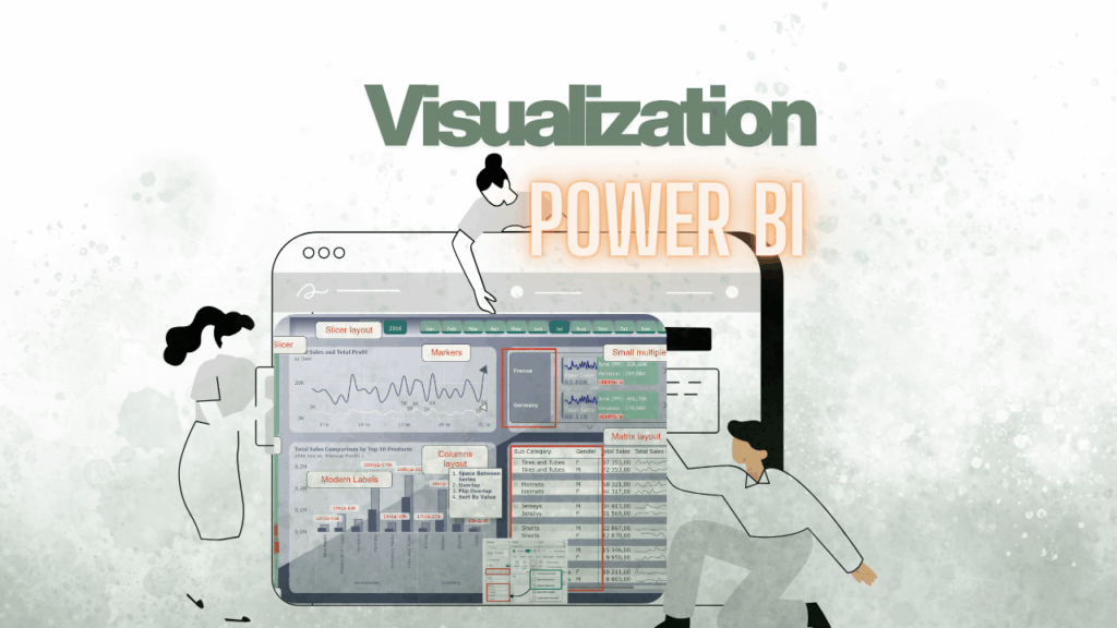
🌟Let’s not forget these fantastic updates from 2024. In my view, they’re incredibly useful and have the potential to elevate your reports to the next level. Don’t miss the chance to leverage them and create stunning, impactful dashboards. Let’s dive into the most exciting changes:
- 🔄 Columns Layout for Bar Charts
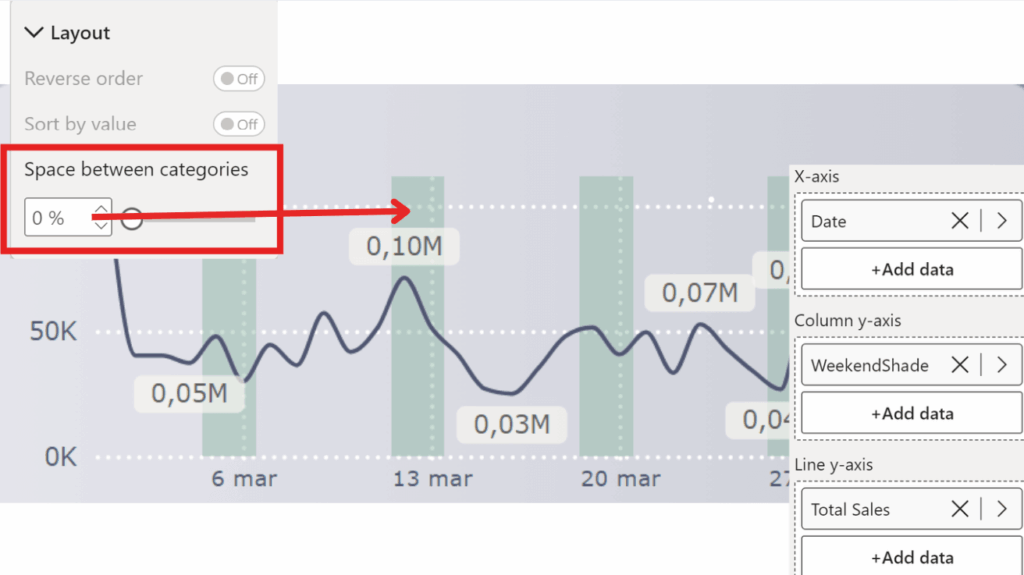
The Space Between Series function can be used to create interesting shapes on a combo chart, such as shaded areas highlighting specific elements like weekends or holidays in a calendar.
To do this:
🎨 Create Combo Chart: Mix a line chart with bar charts – team-up time!
📊 Add Measure: Add a measure to the bars for some magic.
WeekendShade =
IF (
    MIN ( 'Date'[Is Weekend] ),
    [MaxWeekendShade]
)
The [Is Weekend] column in the Date table is designed to indicate whether a given date falls on a weekend. It returns 1 for weekends and 0 for all other days.
MaxWeekendShade =
MAXX (
    ALLSELECTED ( 'Date'[Date] ),
    [TSales]
)
TSales =
SUM ( 'Sales Raw Data'[Sales] ) * 0.8🚫 Remove Bar Gaps: No more awkward spaces – make those bars tight!
🌈 Adjust Colors: Play with transparency and colors to highlight areas.
🗓️ Mark Events: Highlight weekends or holidays with shaded areas.
Boom! A cool combo chart with calendar highlights! 🎉
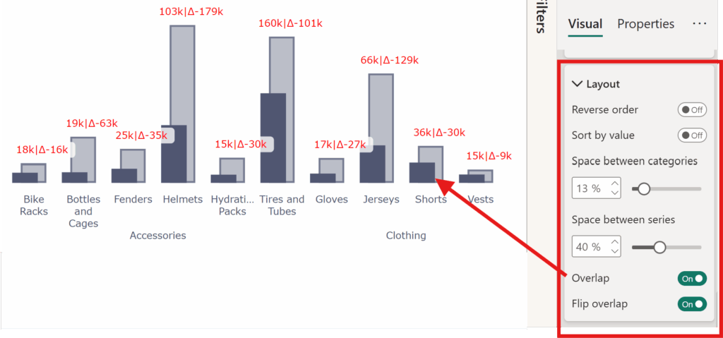
Ever wanted bar charts to stack and overlap elegantly? Now they can! This feature allows better visual representation of comparative data.
BUT The Overlapping Layout for Bar Charts feature can be used also in creative ways to simplify the creation of modern and sophisticated visualizations. For example:
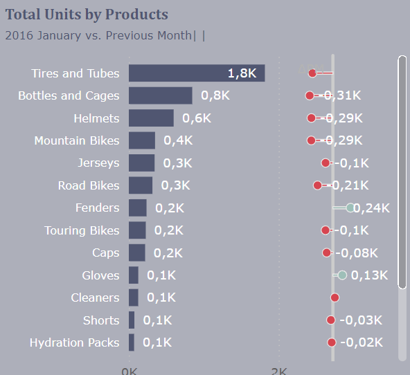
📈 Variance Charts
This layout can help build variance charts where bars represent values, and lines indicate the differences compared to previous periods or targets, making trend analysis more intuitive.
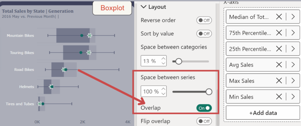
📊 Box Plots
It can also be utilized to create box plots by overlapping bars and lines, effectively visualizing distributions, medians, and ranges without needing dedicated visuals.
By leveraging the overlapping layout, you can enhance your visual storytelling and design advanced chart types directly in your reports.
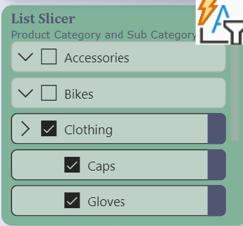
- 🛠️ New List Slicer
Filtering just got an upgrade. The new List Slicer provides enhanced interactivity and styling options, making it easier for users to slice and dice their data intuitively.
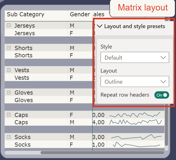
- 🧲 Modern Matrix Layout
The Matrix visual got a sleek redesign, offering more layout flexibility and styling options. Hierarchical data has never looked this clean and organized.
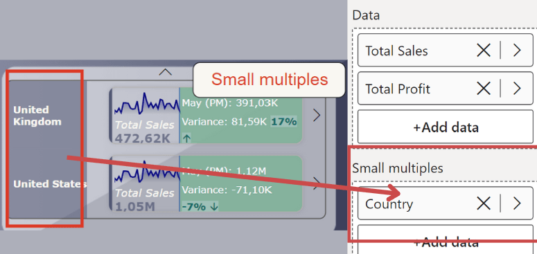
- 📊 Small Multiples for Cards
Cards went small—literally! Small multiples let you display multiple cards side by side, perfect for comparing key metrics at a glance. It’s compact, it’s efficient, and it’s beautiful.
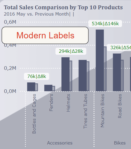
- 🎨 Modern Labels
Say goodbye to bland and static labels. Modern labels allow dynamic customization, offering more control over font styles, colors, and placements. Your visuals just got a professional touch.
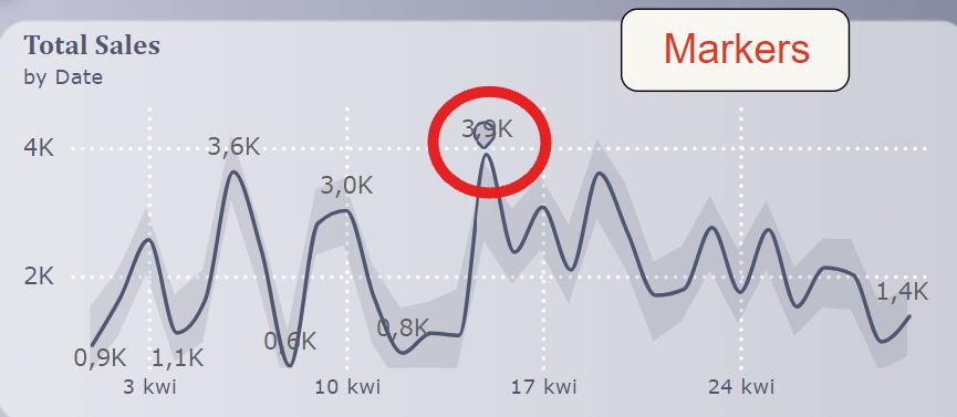
- 🔍 Markers for Better Insights
Add markers to your line charts for specific data points, making them pop. Whether it’s highlighting key milestones or trends, markers make your visuals more engaging.Or customizing markers for all data points within a selected series when a legend is displayed.
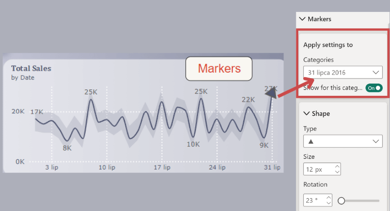
You can toggle the visibility of markers for specific categories using the 'Show for this category’ option. The 'Markers’ toggle is now under 'Show for all series.’
New settings for markers in line, scatter, and anomaly charts include shape control, size, and rotation (excluding circles), allowing for more diverse shape options, especially when multiple lines need unique shapes.
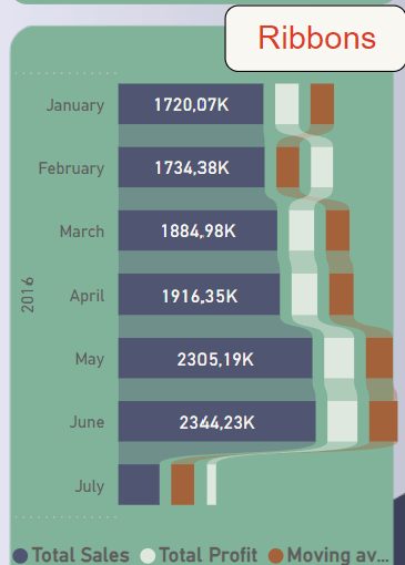
- 🏆 Ribbons for Trend Analysis
Ribbon charts got a boost, making trend analysis smoother and more insightful. With better flow and customization options, your trends won’t just inform—they’ll impress.
Happy visualizing! ✨🎉🥳